CONCEPT PROJECT — HOSPITALITY
Unit 17
Coffee & Community
The brief
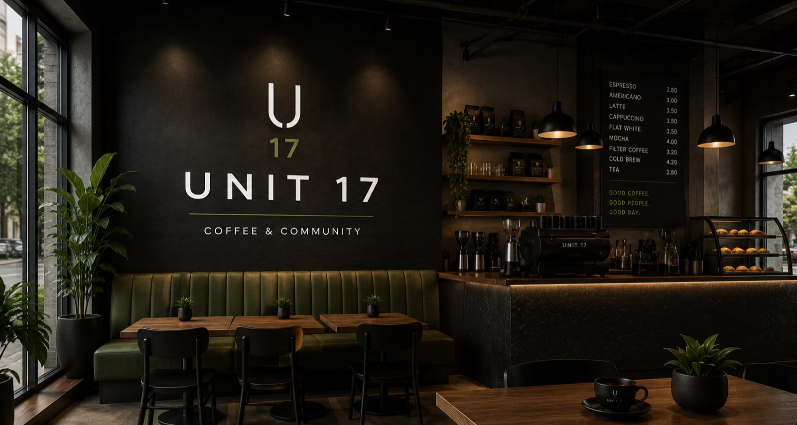
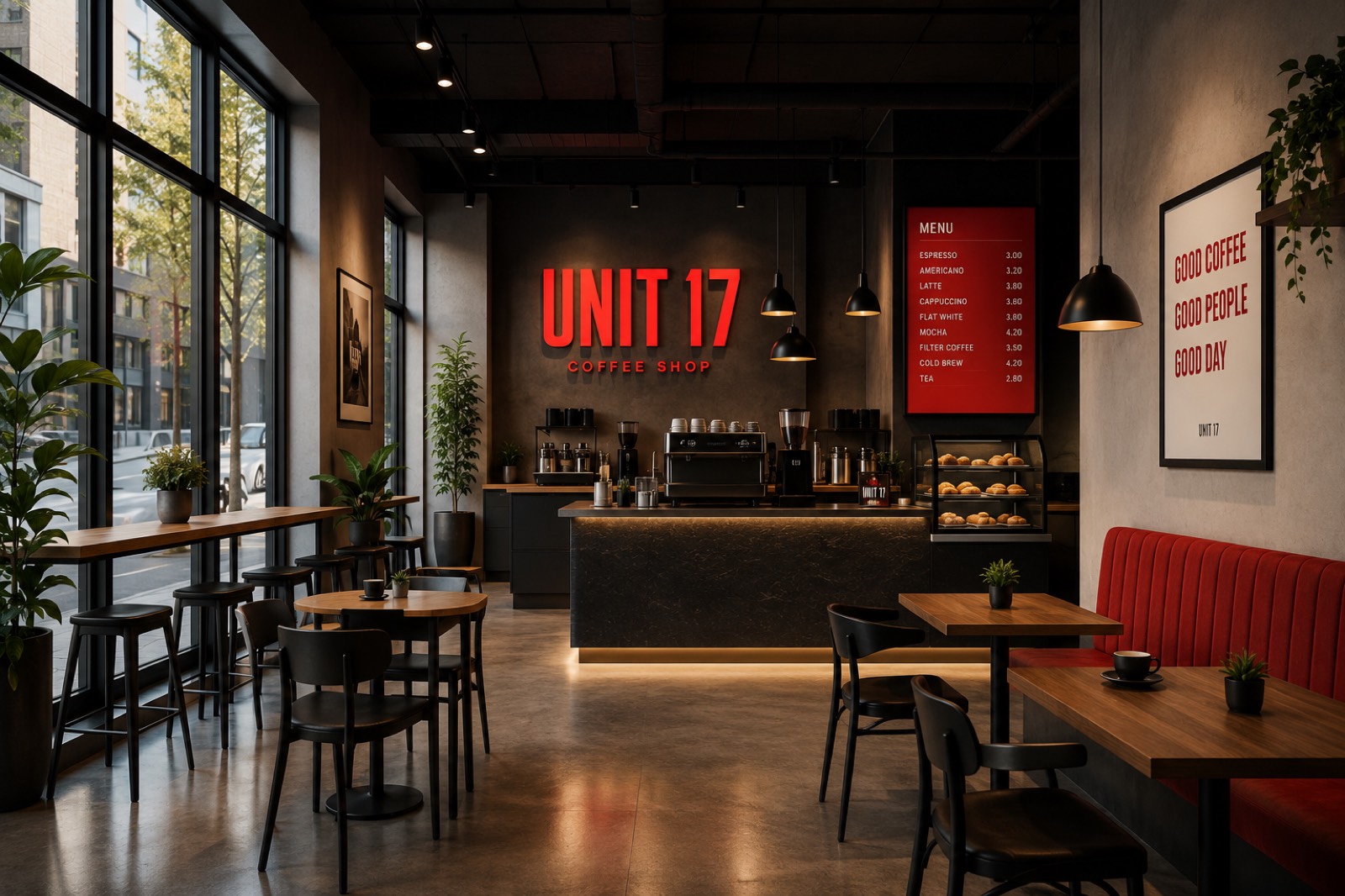
Unit 17 isn't a client — it's a self-directed concept project. I invented a coffee shop with the fundamentals right (good coffee, a loyal following, a name people remember) but a brand that didn't match: a generic red palette and a logo that could belong to any shop on any high street. Then I rebuilt it, start to finish, to show the kind of work a real Presence Rebuild produces.
Before & after
Same shop, same corner site — a completely different first impression.
The approach
New mark
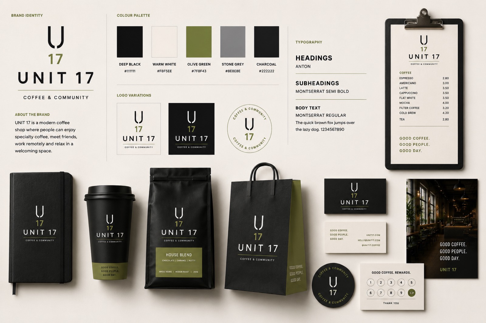
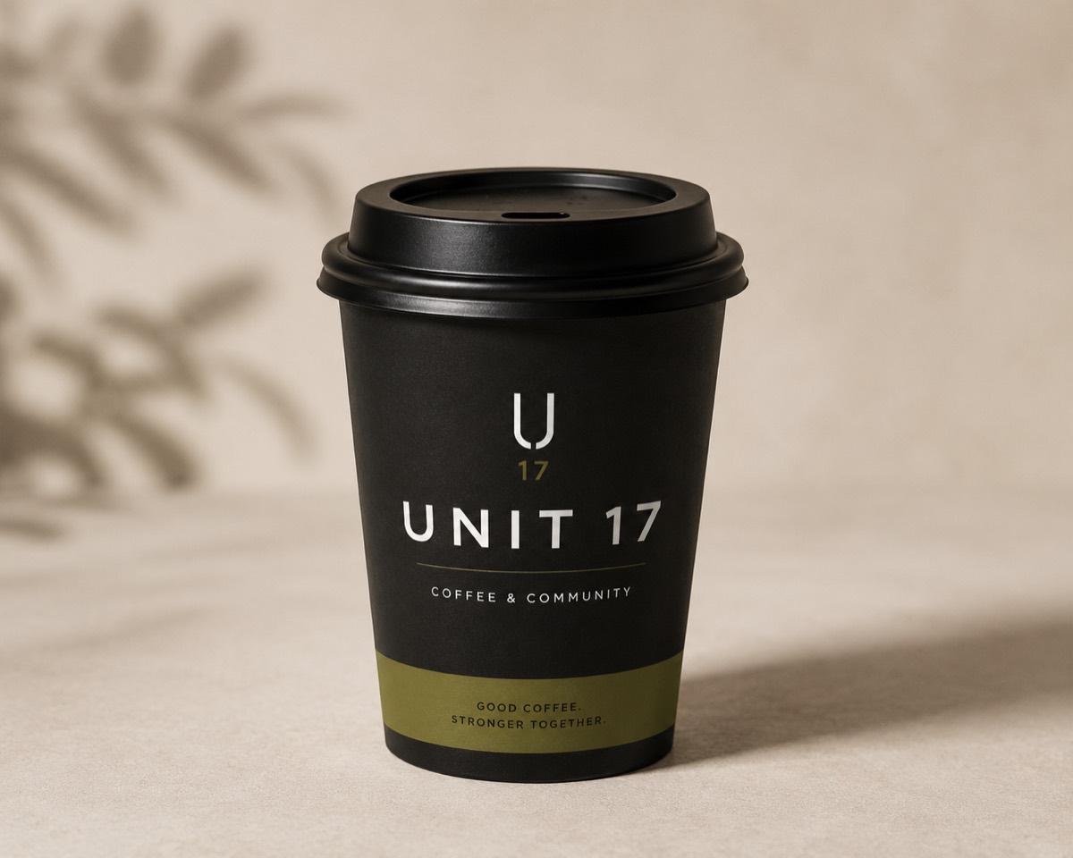
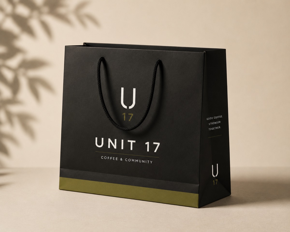
I replaced the generic red wordmark with a considered “U17” monogram and a warmer, more confident “UNIT 17” lockup — built to work as small as a coffee bag label and as large as the wall behind the counter.
A calmer palette
Deep black, warm white and a considered olive green replaced the loud red-on-black scheme, with red kept only as a rare, deliberate accent rather than the whole identity.
A system, not just a logo
Anton for headings and Montserrat for everything else, applied consistently across signage, packaging, business cards and the website — so every touchpoint feels like the same shop.
The website
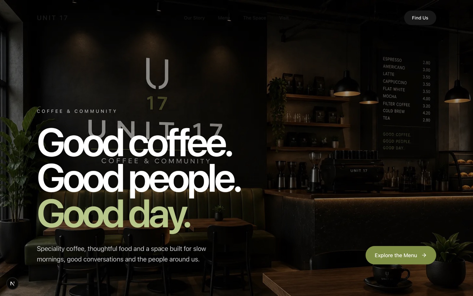
A new one-page site built around the new identity: a bold “Good coffee. Good people. Good day.” hero, the menu front and centre, and a clear path to finding the shop.
The system, in use
RESULT
This is the level of thinking I bring to a real rebuild — brand, system and site working as one, not a logo file and a template.